Players you lock out without knowing: five game accessibility guidelines to start with
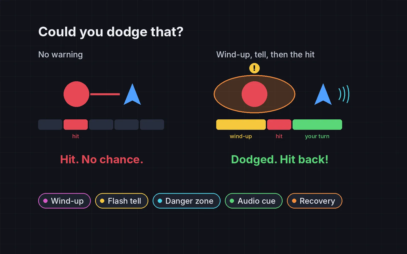
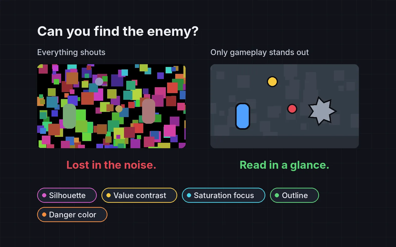
Five game accessibility basics side by side: cues beyond colour, readable subtitles, large high-contrast text, a reduce-motion slider and hold-or-toggle controls with remapping.
What we asked“Make a web page that demonstrates the accessibility options that let more people play one at a time, so anyone can see and feel each one within a few seconds. For each one, show the same short moment side by side: without it on the left, with it on the right, playing in a loop, with a caption that says what just happened and a replay button. Where it helps, let me play the moment myself. It will sit inside a blog post about 720 pixels wide, so it has to look good at that width and on a phone. Also make each one viewable alone with ?trick=<id>&solo, using these ids: color-cues, subtitles, text-contrast, reduce-motion, hold-toggle. Show each moment the way a player who needs the option sees it, for example through a red-green colour-blindness filter for the colour cues. Use the internet freely for better results: free CC0 art, fonts or small libraries (for example Kenney's CC0 assets) are welcome; download anything you use into this folder so the page works without outside links, and list each item with its licence and source in CREDITS.md.”
What happened
- Loaded the accessibility skill
- Downloaded Kenney's CC0 Pixel Platformer art and the Atkinson Hyperlegible font
- Built one card per option, each panel a 640×360 slice of a 1080p screen at real size, so text sizes match what a player sees on a TV
- Showed each moment the way the player who needs it sees it: a red-green filter, sound off, a low-vision blur, a limited grip
- Added a table to every card that the page measures itself, from the pixels on screen
- Stored the sprites and fonts inside the page so it also works opened from disk, and checked it at 720 px and 375 px with no errors
Most players who struggle with your game never tell you. They can’t tell the two teams apart, miss a line of dialogue, can’t read the objective, feel sick from the camera, or can’t hold a button for long. Each of the five fixes below is small, and each comes from the Game Accessibility Guidelines, a free public list for game makers. Every demo plays the same moment twice, without the option on the left and with it on the right, and shows it the way a player who needs the option sees it: through a colour-blindness filter, with the sound off, with blurred sight or a weak grip. The table under each card is measured by the page itself. Where you see Try it yourself, you can play the moment.
1. Don’t say it with colour alone
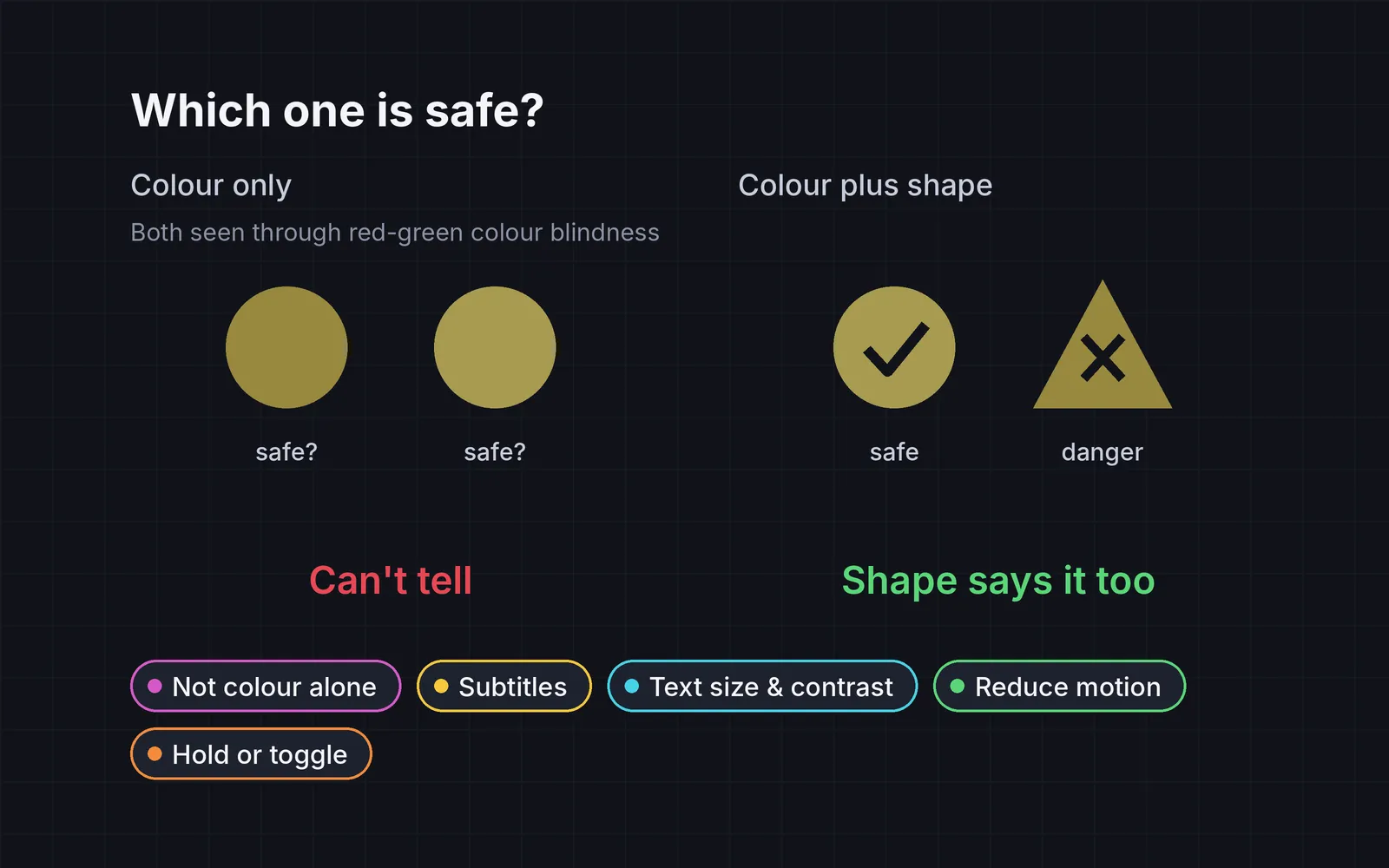
Two characters, one of them a foe, marked only by a red or a green dot. Through a red-green colour-blindness filter, the two dots look almost the same, so you guess and shoot your teammate. The guidelines say red-green difficulty affects around 8 to 10% of men, and that colour should only back up something else: text, a symbol, a pattern or a shape (GAG). For two teams they suggest orange and blue, which suits the three most common types. On the right, the markers are orange and blue, and each also has its own shape and label. In our demo, the colour difference between the two markers through the filter goes from 7 to 127. Try it yourself and click the one you think is the foe; untick the filter to see the colours as they really are.
2. Subtitles you can read
Mira, off-screen, shouts that the bridge is out. With the sound off, as a deaf player has it, the left side walks off the edge. The right side shows the line on a dark box, with her name and an arrow pointing to where she is. The guidelines ask for text no smaller than 46 px at 1080p, no more than 40 characters per line, two lines at most, on a solid or semi-opaque background (GAG). The Last of Us Part II added speaker names and an arrow showing the direction of the person speaking (PlayStation Blog). Our longest line is 25 characters, at 46 px. Untick Sound off to hear the line read aloud.
3. Text size and contrast
A new goal pops up for three seconds over a busy forest. On the left it’s small, pale text straight on the scene, and with the low-vision blur on, it’s gone before you can read it. On the right, the same words sit on a dark panel in larger text. The guidelines treat 28 px at 1080p as a minimum, not a target, and ask for a size option (GAG), and a contrast ratio of at least 4.5:1, using a plain background or outlines over busy scenes (GAG). Measured from the pixels in our demo, the pale text has a contrast of 1.0:1 and the panel text 13.4:1. The slider changes the text size on the right, from 28 to 64 px.
4. A reduce-motion slider
A boss slams the ground. On the left the screen shakes, flashes white, bobs and streaks. For players who get motion sickness or migraines, that moment can end the session. The Xbox Accessibility Guidelines ask you to avoid camera shake, bobbing and motion blur or provide an option to turn them off, and point to Halo Infinite, where players set screen shake, blur, full-screen effects and speed lines on a scale from zero to 100% (Microsoft). On the right, one slider scales all of it. At 0% the camera stays still and an orange border flash marks the hit, so the player still knows it happened. In our demo, the shake goes from about 15 px to 0.
5. Hold or toggle, and let players remap
Sprint across a crumbling bridge. On the left you have to hold the button for about two seconds; with the Limited grip setting, holding gives out after 1.2 s and you fall. On the right, one tap switches sprint on. The guidelines point out that holding a button takes much more strength and control than pressing it, and ask for a toggle, ideally as a setting (GAG). They call remapping “one of the best value accessibility features”, and ask for it in the game itself, so the on-screen prompts show the new keys (GAG). Try it yourself with Space or by holding the panels, then press Remap sprint key and watch the prompt change.
Where to start
You don’t need every option on day one. A few habits make the biggest difference:
- Start with the cheap ones. A shape next to every colour, subtitles on a dark box, and a toggle for every hold cost little if you plan them early, and a lot if you add them after launch.
- Check it the way the player sees it. Take a screenshot in greyscale, play a scene with the sound off, and hold a button with a tired hand. The demos above do the same.
- Measure, don’t guess. Count characters per subtitle line, check text height at 1080p, and read the contrast ratio. The skill asks your agent to report these numbers.
Add it to your game
- Copy the skill at the end of this page into your project.
- Ask your agent: “Make my game playable by more people.”
- Play it, then tune in plain words: “The subtitles are too small on my phone.”
Art in the demos: Pixel Platformer by Kenney (CC0). Font: Atkinson Hyperlegible by the Braille Institute of America (SIL Open Font License 1.1).
The skill that made it work
This is the whole skill we gave Claude Code. Copy it into your project and ask your agent to make your game playable by more people. Every option sits behind its own switch, and the last step makes it measure each one against a number instead of guessing.
- Find everything the player must see, hear or hold: colour-coded states, speech, UI text, camera effects and held buttons.
- Put every option behind one named switch in a single settings object, all on by default, so each can be tested on its own.
- color-cues. Never carry essential information by colour alone. Add a shape, icon, pattern or label to every colour-coded state. For two teams, orange vs blue works for the most common types.
- subtitles. Offer subtitles before any speech plays. At least 46 px tall at 1080p, at most 40 characters per line and two lines, on a semi-opaque box, with the speaker's name. The Last of Us Part II adds speaker names and an arrow pointing to off-screen speakers.
- text-contrast. Body text at least 28 px at 1080p, aim higher, with a size option. Text contrast at least 4.5:1 against its background; over busy scenes use a backing panel or outline.
- reduce-motion. One slider from 0 to 100% that scales screen shake, camera bob, flashes and background motion. At 0, replace shake with a still cue such as a border flash. Halo Infinite lets players set screen shake, blur and speed lines from zero to 100%.
- hold-toggle. Every hold action (aim, sprint, crouch, charge) can be switched to a toggle, and every control can be remapped in-game, with on-screen prompts showing the new keys.
- Measure it. Report: states that differ only by hue in a greyscale screenshot (should be zero), the longest subtitle line in characters, the smallest text height at 1080p, the lowest text contrast ratio, the camera shake in pixels at reduce-motion 0 (should be zero), and hold actions with no toggle (should be zero).
Save it as .claude/skills/accessibility/SKILL.md in your project. Or connect your agent and type /aigamedev: it loads this skill with its reference files and the results from this post.