Why players miss what matters: silhouettes, value contrast and three more readability tricks
Five tricks for visual readability in games, shown side by side with a grayscale toggle: silhouette, value contrast, saturation focus, outlines and one danger color.
What we asked“Make a web page that demonstrates the visual readability tricks that let players read game art at a glance one at a time, so anyone can see and feel each one within a few seconds. For each one, show the same short moment side by side: without it on the left, with it on the right, playing in a loop, with a caption that says what just happened and a replay button. Where it helps, let me play the moment myself. It will sit inside a blog post about 720 pixels wide, so it has to look good at that width and on a phone. Also make each one viewable alone with ?trick=<id>&solo, using these ids: silhouette, value-contrast, saturation-focus, outline, danger-color. Render the same small action scene both ways, and give each demo a grayscale toggle so people can check the values themselves. Use the internet freely for better results: free CC0 art, fonts or small libraries (for example Kenney's CC0 assets) are welcome; download anything you use into this folder so the page works without outside links, and list each item with its licence and source in CREDITS.md.”
What happened
- Loaded the readability skill
- Downloaded Kenney's CC0 font pack, then drew the scene in code instead of using sprites, because each trick has to change shapes, lightness, saturation and outlines on its own
- Rendered it in a headless browser with no errors, and added a way to freeze each loop at one moment for close-up checks
- Fixed the floating leaf dots and wrote CREDITS.md
- Checked the other three tricks, Solid black and Measure, which labels every gameplay object with its contrast ratio
- Re-checked at 720 px and at 390 px phone width with no console errors
Players have a fraction of a second to tell what is what: which shape is me, which one wants to hurt me, which one I can pick up. When the art is beautiful but everything has the same shape, lightness and colour, they miss the arrow, walk into the spikes and blame the controls. Valve designed Team Fortress 2’s nine classes so that “even when viewed only in silhouette with no internal shading at all, the characters are readily identifiable” (Mitchell, Francke and Eng, NPAR 2007).
Every demo below plays the same 3.9-second scene: a hero runs in, an archer on a ledge fires an arrow, the hero jumps the spikes, grabs a gem and hops back from a grunt’s club. The left side has none of the five tricks; the right side has only the one being shown. Grayscale removes colour so you can check lightness yourself, Measure labels each object with its contrast ratio, and Glance test flashes a random frame for 0.7 s and asks you to tap where the hero, gem or hazard was, scoring each side.
1. Silhouette
Give every character type its own shape at the size it appears in play: height, width, head, weapon. On the left, hero, grunt and archer are the same blob in three colours. On the right, the hero has spiky hair and a sword, the grunt is wide and horned with a club, the archer is tall and hooded with a bow. The rule: fill them with solid black. If two still look alike, change the shape, not the colour. Press Solid black to try it.
2. Value contrast
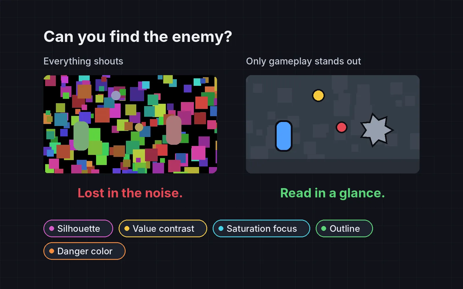
Value means lightness, with colour ignored. Keep the background inside a narrow band of lightness, and make gameplay objects clearly darker (or lighter) than it. The web’s accessibility rules ask for at least 3:1 contrast for graphics against what is next to them (WCAG 2.1), and that is a good floor for games too. One developer blog describes Limbo the same way: light values in the back, very dark values for gameplay (Icewyrm Games). In our demo, without the trick, the hero, grunt and archer drop to about 1.0:1: the archer disappears into the tree and the grunt into the rock. Switch on Grayscale: the right side still works.
3. Saturation focus
Mute the scenery and save strong colour for what the player can use or must avoid. Mirror’s Edge does this with its Runner Vision: route objects turn bold red in a city that is mostly white (Wikipedia). On the left, the sky, flowers, mushroom and banner are as vivid as the gem and the characters, so nothing pulls your eye. On the right, the world is nearly grey, and your eye goes straight to the gem and the three characters.
4. Outline
A 1 to 2 pixel dark outline cuts characters and pickups out of any busy background. On the left, the archer’s cloak merges with the leaves and the gem with the flowers. On the right, the same colours get a clean edge. But Measure shows the limit: on the dark rock, a dark outline only lifts the grunt to about 2.6:1, under the 3:1 floor. On dark backgrounds, a light rim works better. Team Fortress 2 chose exactly that: “Silhouettes are emphasized with rim highlights rather than dark outlines” (Valve paper).
5. One danger colour
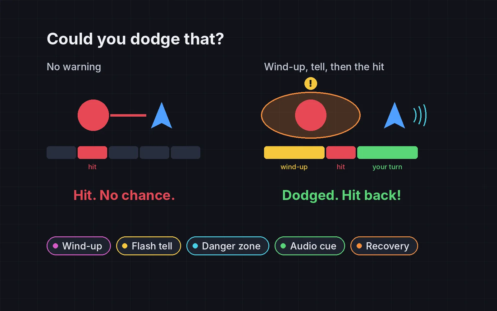
Pick one colour for “this hurts you”, such as red-orange. Use it on every attack, projectile and hazard, and on nothing else. On the left, the arrow is pale wood, the spikes are a dull bramble, and the red goes to flowers, a mushroom and a banner: three harmless things in the danger colour. On the right, the arrow, spikes and club swing are all one red-orange, and nothing harmless uses it. Always pair the colour with a shape, like sharp points or a streak. Xbox’s accessibility guidelines say “color alone should never be used to represent information” (Microsoft).
Check it, don’t trust your eye
You made the art, so you always know where everything is. Your players don’t. Three quick checks:
- The grayscale test. Take a screenshot of a busy moment and remove the colour. You should find the player, enemies, hazards and pickups in under a second.
- Contrast against the local background. At least 3:1 for every gameplay object, measured against what is right behind it, not the average of the screen. With all five tricks on, every object in our demo stays at least 10.5:1 through the whole loop.
- Count the danger colour. Harmless things in the danger colour should be zero.
The tricks have a price too. Squeezing the background into a light band made the gem a dark olive in our all-tricks version. If a pickup has to look valuable, give it a light rim or a glow instead of letting it go dark.
If your characters still look alike in black, the problem starts in the design: see shape language in character design.
Add it to your game
- Copy the skill at the end of this page into your project.
- Ask your agent: “Players keep missing enemies and pickups. Make my game easier to read.”
- Play it, then tune in plain words: “The background is too grey now, bring a little colour back.”
Fonts in the demos: Kenney Future by Kenney (CC0) and Atkinson Hyperlegible by the Braille Institute (SIL Open Font License 1.1). The scene is drawn in code.
The skill that made it work
This is the whole skill we gave Claude Code. Copy it into your project and ask your agent to make your game easier to read. Every trick sits behind its own switch, and the last step measures contrast and checks screenshots in grayscale.
- Find everything the player must notice: the player, each enemy type, attacks, hazards, pickups, doors and buttons. Note what sits behind them.
- Put every trick behind one named switch in a single settings object, all on by default plus a grayscale toggle.
- silhouette. Give each character and enemy type a distinct shape at gameplay size: height, width, head, weapon outline. Fill them with solid black: if two look alike, change the shape, not the color.
- value-contrast. Keep the playfield background in a narrow value range and make gameplay objects clearly lighter or darker than it, with a contrast ratio of at least 3:1 against what is behind them (the WCAG minimum for graphics). Limbo does this with light backgrounds and very dark gameplay elements.
- saturation-focus. Desaturate the background and decoration and save strong, saturated color for what the player can use or must avoid. Mirror's Edge turns route objects bold red in a mostly white city.
- outline. Give characters and interactables a 1 to 2 pixel dark outline, or a light rim on their edges, so they separate from any background. Team Fortress 2 uses rim highlights instead of dark outlines.
- danger-color. Pick one color for "this hurts you", such as red-orange, and use it on every enemy attack, projectile and hazard, and nowhere else. Pair it with a shape (spikes, a warning sign), because color alone fails color-blind players.
- Measure it. Take screenshots of busy moments, convert them to grayscale and check you can find the player, enemies, hazards and pickups in under a second. Compute each gameplay object's contrast ratio against its local background (at least 3:1) and count uses of the danger color on harmless things (should be 0).
Save it as .claude/skills/readability/SKILL.md in your project. Or connect your agent and type /aigamedev: it loads this skill with its reference files and the results from this post.