Why players skip your dialogue: game dialogue box design in five tricks
The same conversation in a plain box and a good one: typewriter text you can tap through, a narrow box with a portrait, short lines, ambient barks and matching faces.
What we asked“Make a web page that demonstrates the dialogue box tricks that make game dialogue easy to read one at a time, so anyone can see and feel each one within a few seconds. For each one, show the same short moment side by side: without it on the left, with it on the right, playing in a loop, with a caption that says what just happened and a replay button. Where it helps, let me play the moment myself. It will sit inside a blog post about 720 pixels wide, so it has to look good at that width and on a phone. Also make each one viewable alone with ?trick=<id>&solo, using these ids: typewriter, narrow-box, short-lines, barks, expression. The left side should be the plain default many first games ship: a full-width box with all the text at once, no portrait and no name. Use the internet freely for better results: free CC0 art, fonts or small libraries (for example Kenney's CC0 assets) are welcome; download anything you use into this folder so the page works without outside links, and list each item with its licence and source in CREDITS.md.”
What happened
- Loaded the dialogue-box skill
- Kenney's art download needed a browser session, so it got two free OFL fonts instead and drew the portraits, sprites and village as SVG in code, so every face matches its mood
- Built five cards with a small "press" key that flashes whenever the autoplay presses
- Made barks measure their text so longer lines stay inside the scene
- Switched the bark outline to a real text stroke, because the old one made the letters run together
- Checked that text never moves on by itself (it waits over 6 s for a press), in Chrome and Safari's engine at 720 px and 390 px
Players see your dialogue box hundreds of times. If the first one is a wall of text, they learn to mash the button, and your story goes unread. Small choices about the box decide whether people read or skip. Even Pokémon lets players pick how fast its text appears (Bulbapedia).
In every demo below, the left side is the plain default many first games ship: a full-width box, all the text at once, no portrait and no name. The right side turns one trick on. A small “press” key flashes when the autoplay presses a button. Click or tap either side to play it yourself (Space works too), and Replay goes back to the loop.
1. Typewriter text
Reveal the text a few letters at a time, about 30 to 60 characters a second, with a short pause after commas and full stops. The first press shows the whole line at once, the next press moves on, and nothing ever moves on by a timer. A timer can’t fit everyone: “it is not possible to set a speed for text to be displayed which will be appropriate for all readers” (Game Accessibility Guidelines). Ren’Py measures text speed in characters per second, and its docs use 40 as the example (Ren’Py). Our demo types at 45 a second. Try the Slow 30 and Fast 60 buttons, and press in the middle of a line.
2. A narrow box with a face and a name
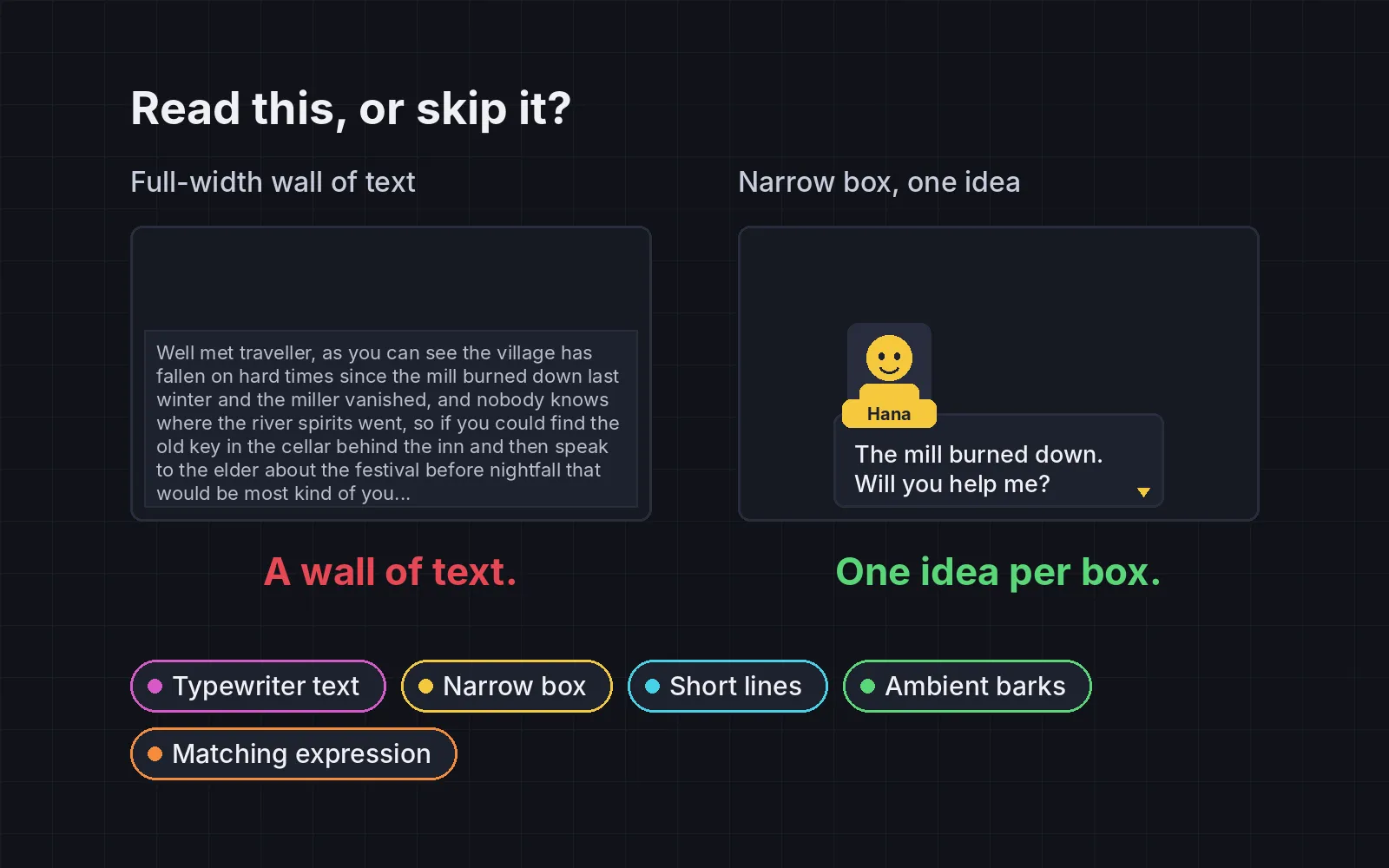
Make the box about 560 px wide on a normal screen, centred low, never edge to edge. The speaker’s portrait stands on the box’s top-left corner, with a name plate under it. Lines that run across a whole wide screen are tiring to read: for print, 45 to 75 characters a line is the usual advice (Wikipedia). In his guide to subtitles, Ian Hamilton also recommends placing text centred at the bottom of the screen by default (Game Developer). On the left of our demo, a new line appears and you can’t tell who said it. On the right, Bram’s face and name sit on the box. In a 720 px blog column the difference is small (about 53 characters a line against about 35); on a real game screen it is much bigger.
3. Short lines, one idea per box
Put one idea in each box, two or three lines at most, and split long speeches into several boxes. Keep them full sentences, with their verbs and articles. For game subtitles, Ian Hamilton suggests about 38 characters a line and no more than two lines (Game Developer). In our demo, the left side is one 265-character speech: 5 lines and four ideas in one box. The right side says the same thing in five short boxes, and the counters under each side keep score.
4. Barks as you walk past
Not every line needs a box. When the player walks past, people can call out a short floating line, with no box and no portrait: “Bridge is out, friend.” Vary the lines, give each person a cooldown of several seconds, let only the nearest one or two talk, and make them go quiet once the player has spoken to them. Valve’s Elan Ruskin explained how Left 4 Dead’s characters “understand and remark on their circumstances” by matching what is happening against thousands of lines (GDC Vault). In our demo the cooldown is 6 s, Pip notices the bread you carry, and Mira goes quiet after you talk to her. Click a side, then tap to walk and tap someone to talk.
5. Expressions that match the line
Tag each line with a mood and swap the portrait to match: a proud face for a boast, a worried face for bad news. Add a blink and a simple mouth (closed, half open, open) while the text types. Ren’Py works this way: the portrait it shows depends on the expression tagged on the character’s line (Ren’Py). Our characters have five moods each. One thing to know: the right side here also uses the narrow box and typewriter, because a face needs a portrait and a moving mouth needs typing text. To compare the expressions alone, switch the left side to Still face.
If your characters all sound the same, the box can’t fix that. See writing distinct character voices.
Let players choose
Readers are different, so the best defaults still need options:
- Text speed. Offer slow, medium, fast and instant, and keep the first press showing the whole line.
- Never on a timer. Even a generous timer is too fast for someone.
- Keep barks rare. If people talk every time you pass, it becomes noise. Long cooldowns, and only the nearest one or two.
- Check the numbers. Count lines over about 55 characters, boxes over three lines and boxes with two ideas; all should be zero. Then show five lines without names to a friend: they should be able to tell who said each one.
Add it to your game
- Copy the skill at the end of this page into your project.
- Ask your agent: “Make the dialogue in my game easier to read.”
- Play it, then tune in plain words: “The text types too slowly.”
Fonts in the demos: Atkinson Hyperlegible by the Braille Institute and Fredoka by The Fredoka Project Authors (SIL Open Font License 1.1).
The skill that made it work
This is the whole skill we gave Claude Code. Copy it into your project and ask your agent to make your dialogue easier to read. The last step counts long lines, crowded boxes and missing moods, so you can see what to fix.
- Find how dialogue is shown: the box, the text reveal, the advance input, portraits, and any text NPCs show outside conversations.
- Put every trick behind one named switch in a single settings object, all on by default, so each can be tested on its own.
- typewriter. Reveal text at about 30 to 60 characters a second, with a short pause after commas and full stops. The first press shows the whole line at once; the next press advances. Never advance on a timer.
- narrow-box. Use a box about 560 px wide, centred low on the screen, never full width. The speaker's portrait stands just above the box's top-left corner, with the name plate centred under it on the box edge. Print aims for 45 to 75 characters per line; a full-width box goes far past that.
- short-lines. One idea per box, at most two or three lines. Split long speeches into several boxes. Short lines are still full sentences: keep verbs and articles.
- barks. When the player walks past, NPCs call out short floating text with no box and no portrait ("Fresh bread, still warm!"). Vary the lines, add a cooldown of several seconds, keep only the nearest one or two talking, and stop once the player has spoken to that NPC. Left 4 Dead picks such lines from what is happening around the characters.
- expression. Tag each line with a mood and swap the portrait to match: a proud face for a boast, a worried face for bad news. Add a blink and simple mouth frames (closed, half, open) while the text types, and keep mouths modest.
- Measure it. Count lines over about 55 characters, boxes over three lines and boxes with two ideas (should be zero). Check every line has a mood tag that matches its portrait. Then show five lines without names to someone: they should be able to say who said each.
Save it as .claude/skills/dialogue-box/SKILL.md in your project. Or connect your agent and type /aigamedev: it loads this skill with its reference files and the results from this post.