"I can't find my character": game HUD design with a clear centre, ranked messages and three more tricks
Five game HUD design tricks, side by side: keep the centre clear, show elements only when needed, rank and hold messages, show enemy bars only when relevant, and one UI style.
What we asked“Make a web page that demonstrates the HUD layout tricks (what is on screen during play) one at a time, so anyone can see and feel each one within a few seconds. For each one, show the same short moment side by side: without it on the left, with it on the right, playing in a loop, with a caption that says what just happened and a replay button. Where it helps, let me play the moment myself. It will sit inside a blog post about 720 pixels wide, so it has to look good at that width and on a phone. Also make each one viewable alone with ?trick=<id>&solo, using these ids: clear-center, show-when-needed, message-priority, target-bars, one-style. Use one small top-down action scene with several enemies for every trick, so the left side shows a crowded, hard-to-read HUD and the right side the same moment cleaned up. Use the internet freely for better results: free CC0 art, fonts or small libraries (for example Kenney's CC0 assets) are welcome; download anything you use into this folder so the page works without outside links, and list each item with its licence and source in CREDITS.md.”
What happened
- Loaded the hud-layout skill
- Downloaded Kenney's Tiny Dungeon sprites and Kenney Fonts, pulling the download links out of the page source because Kenney's site hides them behind a pop-up
- Wrote one shared simulation, so both sides show the same fight at the same moment, and one HUD with five on/off switches
- Ran every scripted loop to check that the events the captions describe really happen
- Moved panels to the edges until the middle was almost empty, and made placement avoid overlaps
- Drove Play it yourself with the keyboard and a mouse drag, and checked the page at 720 px and on a 375 px phone
You look away from your hero for a second, and when you look back you can’t find them. A spider is hiding under the quest panel, a message about an achievement covered the warning you needed, and every enemy has a health bar and a pile of numbers above it. A HUD (the bars, counters and messages drawn over play) should answer “what do I need right now?” and otherwise stay out of the way. Each demo below plays the same moment in one small dungeon room: a knight fighting slimes, bats, spiders and bandits. The left side has a crowded HUD, the right side turns on one trick, and the live number under each picture measures the difference. Play it yourself gives you the knight (arrow keys or WASD, or press and drag on either picture); the knight attacks on their own and new waves keep coming.
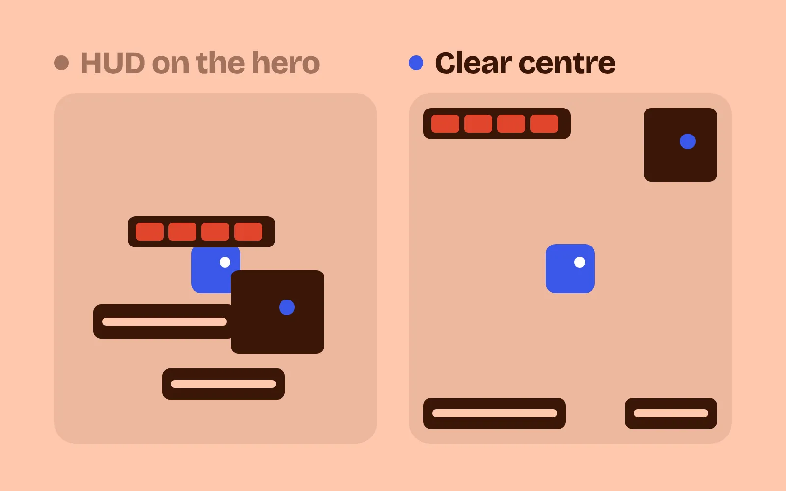
1. Keep the middle clear
Pin every HUD element to a corner or an edge, and put nothing permanent in the middle 60% of the screen. Group related values (health, mana, level) into one panel instead of three. If the player or an enemy walks under a panel, fade it to about 30%, so nothing can hide there. Leave a 5% margin from the screen edge: Xbox’s guidelines ask for all important text and UI inside the inner 90% of the screen, the “title-safe area” (Xbox developer docs). In our demo, panels cover about 40% of the middle on the left and 3 to 5% on the right. In the loop, a ghost walks under the minimap: on the left it vanishes, on the right the panel fades and you can still see it.
2. Show it only when it matters
Most HUD elements don’t need to be on screen all the time. Show the gold counter when gold changes, the arrow count while aiming, then fade them out after about 3 s. Systems the player hasn’t met yet stay hidden until they are introduced. A Game Developer article on dynamic interfaces describes the same pattern: combat elements leave when the fight ends, and a breath meter appears only underwater (Game Developer). In our demo, the left side always shows 11 elements; the right side shows between 0 and 6, depending on the moment.
3. Rank messages and wait for calm
Not every message is equally important. Give them three tiers: urgent messages go big, in a strong colour, at the top centre; normal ones go to a side feed, at most 3 on screen; minor ones only go to the log. Non-urgent messages wait until no enemy is near, then stay for 2 calm seconds. Players in a fight often look at one spot and miss changes elsewhere on the screen, which is why a short change in size, brightness or colour is the way to pull their eyes (Game Developer). Xbox’s accessibility guidelines also ask that timed notifications can stay longer or be dismissed by the player (Xbox Accessibility Guideline 116). In our demo, the left side loses 6 messages mid-fight; the right side loses none.
4. Bars only on targets
A health bar over every enemy turns a fight into a wall of red. Show an enemy’s bar only once it is hit or targeted, and hide it again after about 4 s untouched. Keep damage numbers small, and never more than 5 at once. Give your hero a ground ring or outline that nothing else uses, so the eye finds them first. In our demo, the left side shows 8 enemy bars and up to 11 damage numbers; the right side shows bars only on the enemies you’re fighting and at most 5 numbers. In this demo and the next, both sides already keep the middle clear, so the only difference you see is this one trick.
5. One style
Use one font, one panel style (the same corners, border and fill, in colours from your game’s palette) and three text sizes: label, value (about 1.5 times the label) and heading (about 2 times). Use one icon size everywhere. The Game Accessibility Guidelines ask for “simple clear text formatting” (Game Accessibility Guidelines), and Xbox’s guidelines ask that repeated elements keep the same place and look across the game (Xbox Accessibility Guideline 112). The left side of our demo uses 10 fonts, 11 text sizes, 5 panel styles and 6 icon sizes; the right side uses 1 font, 3 sizes, 1 panel style and 1 icon size. Choose a font with clear letters: in our first try, “K” and “x” looked like “H”, so “x6 COMBO” read as “H6 COMBO”.
Every demo also has a Right side: all five tricks box. Tick it to see the fully crowded HUD against the fully cleaned one.
Don’t hide too much
A clean HUD is not an empty one. Some rules for tuning it:
- Keep what the player checks all the time. If players look at their health every few seconds, keep it on screen. Fading is for things that change now and then, like gold or keys.
- Don’t let urgent messages wait. Only normal and minor messages queue for a calm moment. “Low health” goes out at once.
- Check the text size where it will be seen. In our demo, each picture is about 350 px wide at blog width, so the smallest HUD text shows at about 8 px. That’s tight. Test on the smallest screen your players use.
If your health bar itself is hard to read, see health bar UI design.
Add it to your game
- Copy the skill at the end of this page into your project.
- Ask your agent: “My HUD is cluttered and players can’t find their character. Clean it up.”
- Play it, then tune in plain words: “The gold counter fades too fast.”
Art in the demos: Tiny Dungeon and Kenney Fonts by Kenney (CC0).
The skill that made it work
This is the whole skill we gave Claude Code. Copy it into your project and ask your agent to clean up your HUD. The last step makes it measure how much of the middle is covered and how many messages players miss, with each trick off and on.
- Find everything drawn over play (bars, counters, icons, messages, floating text, enemy bars), where it sits and when it shows.
- Put every trick behind one named switch in a single settings object, all on by default, so each can be tested on its own.
- clear-center. Anchor every HUD element to a corner or edge, inside a 5% margin. Nothing permanent in the middle 60% of the screen. Group related values in one panel. When the player or an enemy moves under a panel, fade it to about 30%.
- show-when-needed. Show an element when its value changes or it becomes relevant (ammo while aiming), then fade it after about 3 s. Hide elements for systems the player hasn't met until they are introduced.
- message-priority. Three tiers: urgent (big, top centre, strong colour), normal (side feed), minor (log only). At most 3 on screen. Queue non-urgent messages until no enemy is near or the fight ends and keep each until it has had 2 s on a calm screen.
- target-bars. Hide enemy health bars until that enemy is damaged or targeted, and hide them again after about 4 s untouched. Keep floating numbers small, at most 5 at once. Give the player character an outline or ground ring nothing else uses.
- one-style. One font family, one panel style (same corner radius, border and fill from the game's palette) and three text sizes: label, value (about 1.5x label) and heading (about 2x). One icon size everywhere.
- Measure it. Screenshot 10 fixed moments of a scripted run with tricks on and off. Report the share of the central 60% covered by HUD pixels (aim under 5%), visible HUD elements per moment, messages that expired before a calm moment (should be zero), and the count of fonts, text sizes and panel styles (1, 3 and 1).
Save it as .claude/skills/hud-layout/SKILL.md in your project. Or connect your agent and type /aigamedev: it loads this skill with its reference files and the results from this post.