Why your game's colors look muddy: limited palettes, hue shifting and three more color palette tricks
Five color palette tricks for game art, shown side by side: limited palette, hue-shifted ramps, harmony, value range and palette swaps, with ramp values you can copy.
What we asked“Make a web page that demonstrates the color palette tricks that make game art look cohesive one at a time, so anyone can see and feel each one within a few seconds. For each one, show the same short moment side by side: without it on the left, with it on the right, playing in a loop, with a caption that says what just happened and a replay button. Where it helps, let me play the moment myself. It will sit inside a blog post about 720 pixels wide, so it has to look good at that width and on a phone. Also make each one viewable alone with ?trick=<id>&solo, using these ids: limited-palette, hue-shift, harmony, value-range, palette-swap. Use the same small scene of tiles and sprites in every demo, show the palette as swatches under each side, and add a copy button for the right side's color values. Use the internet freely for better results: free CC0 art, fonts or small libraries (for example Kenney's CC0 assets) are welcome; download anything you use into this folder so the page works without outside links, and list each item with its licence and source in CREDITS.md.”
What happened
- Loaded the palette skill
- Downloaded the Silkscreen pixel font; Kenney's downloads needed JavaScript, so it drew the scene and sprites in code instead
- Stored a ramp and a shade for every pixel instead of a color, so each trick can recolor every pixel exactly
- Put palette swatches under each side, with a Copy colors button on the right
- Added Play it yourself, a Grayscale button, a slider for hue shift per step and one to turn the harmony scheme
- Checked it at 720 px and at 375 px with no errors, and fixed copied ramps keeping their old names after the scheme turned
Every sprite looks fine on its own, but put them together and the screen looks muddy, or like five games glued together. The fix is rarely more colors. It’s fewer colors, chosen as a set. Celeste began as a four-day game jam entry on PICO-8 (Wikipedia), a fantasy console with a fixed palette of 16 colors (PICO-8 manual). Below, the same little platformer moment plays on both sides: the hero hops a slime, jumps onto a block, grabs a gem, and a big slime powers up. The right side has all five tricks on; the left turns off only the one being shown. The swatches under each side are its palette, Copy colors copies the right side’s hex values, Grayscale shows the scene by lightness alone, and Play it yourself lets you run and jump with the arrow keys and Space.
1. A limited palette
Choose 8 to 32 colors and snap every pixel to the nearest one. In our demo, the left side puts about 1,500 different colors on screen: a smooth sky gradient, a slightly different tint on every tile, sprites shaded in colors of their own. The right side uses a fixed palette of 25. The sky, the ground and the sprites now come from the same set, so they look like they belong together. Tap a swatch to see where that color is used.
2. Hue-shifted ramps
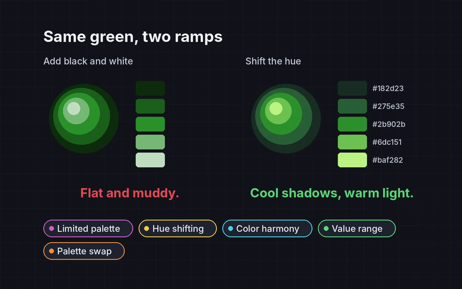
Build each color as a ramp of 4 to 6 steps from dark to light, and don’t just add black and white. Pixel artist Raymond Schlitter calls this hue shifting: the hue moves across the ramp and warms as the colors get brighter, by up to about 20 degrees per step (Slynyrd). Our rule of thumb sends lighter steps toward yellow and darker steps toward blue. On the left, the green ramp stays at 120° at every step, and the shadows turn gray and flat. On the right, it runs from 150° to 90°, so the darks stay rich and the highlights look sunlit. Drag the slider to change the shift per step.
3. Color harmony
Pick hues by a scheme, not one by one. Analogous colors sit next to each other on the color wheel, and complementary colors sit on opposite sides (Wikipedia). Use neighboring hues for the world and one opposite hue for the player and the things to grab, and let one hue cover most of the screen. On the left, every thing got its own hue: purple sky, orange hills, a green tunic that gets lost in the grass. On the right, the world stays in green, teal and blue, and red is saved for the hero and the gem, so your eye goes straight to them. The color wheels show each hue, with bigger dots for more screen. Turn the scheme to rotate all the hues together, or Reroll left hues to try other random picks.
4. A full value range
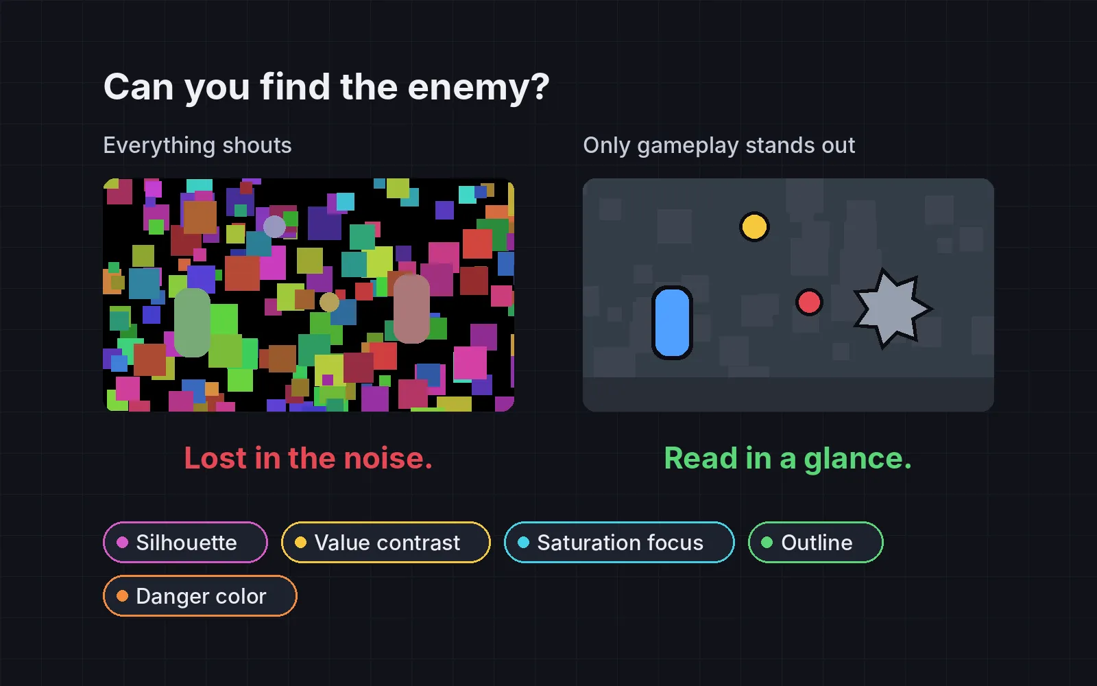
Value is how light or dark a color is, and it’s what your eye uses first to pick out shapes. Spread your palette from near black to near white, and keep things that must be told apart, like the player and the ground, far apart in lightness, not just in hue. A quick check, suggested by the developer blog Ice Wyrm Games: desaturate a screenshot and see if it still reads (Ice Wyrm). For a number, use the 3:1 contrast that web accessibility rules ask for graphics (W3C). In our measurement, the hero stood out at 1.7:1 on the left and 4.9:1 on the right. The caption measures it live from the frame, so the number moves a little as the hero walks. Tint the darkest color instead of using pure black.
5. Palette swaps
Make enemy variants, teams and power-ups by mapping each ramp onto another ramp instead of redrawing. Mortal Kombat’s Scorpion and Sub-Zero started out in design notes as “a palette swap for 2 ninjas”, because, as Ed Boon put it, you could change a character’s color and use basically the same memory (Wikipedia). When the hero grabs the gem, the big slime powers up. The left side recolors it with a hue-rotate filter, which adds colors that aren’t in the palette and barely changes its lightness, so in grayscale it’s the same old slime. The right side maps its blue ramp onto the red one, one step darker, so it looks tougher even in gray. Try Fire, Moss and Shadow.
Check it in grayscale
The tricks pull in different directions, so check the result, not each step:
- Count your colors. Take a screenshot and count the unique colors. It shouldn’t be more than your palette size.
- Print each ramp’s hue per step. It should move steadily one way, not jump around.
- Look at it in gray. The player should stand out from the background at 3:1 or more. If two things only differ in hue, they’ll merge for some players, and in a hurry for everyone.
Once your colors work, light decides which ones the player sees at night. See five 2D lighting techniques.
Add it to your game
- Copy the skill at the end of this page into your project.
- Ask your agent: “Give my game a cohesive color palette.”
- Play it, then tune in plain words: “The shadows look too purple.”
Font in the demos: Silkscreen by Jason Kottke (SIL Open Font License 1.1). The scene and sprites were drawn in code for the demo.
The skill that made it work
This is the whole skill we gave Claude Code. Copy it into your project and ask your agent to give your game a cohesive palette. Every trick sits behind its own switch, and the last step makes it count colors and check the result in grayscale.
- Find every color the game uses (sprites, tiles, effects, UI) and count them.
- Put every trick behind one named switch in a single settings object, all on by default, so each can be compared with the original colors.
- limited-palette. Choose 8 to 32 colors and snap every color to the nearest one.
- hue-shift. Build each color as a ramp of 4 to 6 steps from dark to light. Don't just add black or white: move the hue toward yellow (60 degrees) as steps get lighter and toward blue (240 degrees) as they get darker, about 10 to 20 degrees per step, with saturation highest in the middle. In HSV for step i of n: value = 18% + i x 77% / (n-1); saturation = 70% - 12% per step away from the middle. A green ramp: #182d23 #275e35 #2b902b #6dc151 #baf282.
- harmony. Pick hues by a scheme: analogous (neighbors on the color wheel) for the world, plus one complementary accent (opposite side) for the player and things to use. Let one hue dominate most of the screen.
- value-range. Spread the palette from near black to near white, and keep colors that must be told apart (player and ground, enemy and wall) far apart in grayscale, not just in hue. Tint the darkest color instead of using pure black.
- palette-swap. Make enemy variants, teams and elements by mapping each ramp to another ramp, not redrawing. Mortal Kombat's Scorpion and Sub-Zero began as one palette-swapped ninja to save memory. Make stronger variants differ in value too, not only hue.
- Measure it. Count unique colors in screenshots (no more than the palette size), print each ramp's hue per step (it should move steadily one way), and view screenshots in grayscale: the player should have a contrast ratio of at least 3:1 against the background.
Save it as .claude/skills/palette/SKILL.md in your project. Or connect your agent and type /aigamedev: it loads this skill with its reference files and the results from this post.