"What does this number mean?": game tooltip design with plain effects, nested keywords and three more tricks
Five game tooltip design tricks, side by side: label every icon, write effects as plain outcomes, nest keyword tooltips, call out rules as they fire and show controls in place.
What we asked“Make a web page that demonstrates the tooltip and glossary tricks (explaining icons, numbers, rules and controls on demand) one at a time, so anyone can see and feel each one within a few seconds. For each one, show the same short moment side by side: without it on the left, with it on the right, playing in a loop, with a caption that says what just happened and a replay button. Where it helps, let me play the moment myself. It will sit inside a blog post about 720 pixels wide, so it has to look good at that width and on a phone. Also make each one viewable alone with ?trick=<id>&solo, using these ids: icon-labels, plain-effect, nested-terms, rule-callout, key-hints. Use one small strategy or RPG screen, and on each side show the same moment with a cursor hovering, so the left shows a bare icon or jargon and the right the explanation the player gets. Use the internet freely for better results: free CC0 art, fonts or small libraries (for example Kenney's CC0 assets) are welcome; download anything you use into this folder so the page works without outside links, and list each item with its licence and source in CREDITS.md.”
What happened
- Loaded the tooltips-and-glossary skill
- Downloaded Kenney's Tiny Dungeon sprites and two Kenney fonts (all CC0) into the project
- Built one small dungeon battle (a knight, a poisoned wizard, a Cave Spider and a Cyclops) where each side differs only by one switch, shown above it
- Screenshotted it at 720 px and phone width, then fixed the one effect text that had no number
- Moved the Backstab call-out so the damage number and "Defeated" no longer cover it, and moved the Tab hint below the unit
- Added a Try it mode: hover, touch-and-hold, Tab and keys all work, and keys go to both sides at once
A player hovers over an icon and nothing happens. Or a tooltip says “+0.2 ATK mult” and they have to guess what that means. Or their wizard dies and they never find out why. Players can’t use a rule they can’t read. Crusader Kings III became known for fixing this: “The game’s tooltips will, themselves, have tooltips” (PC Gamer).
Each demo below shows the same moment in a small dungeon battle, twice. A scripted cursor hovers on both sides; the left has the trick switched off and the right has it on (the switch name sits above each side). The caption under the pair changes as the moment plays. Press Try it to stop the loop and play both sides yourself: hover with a mouse, touch and hold on a phone, or use Tab and the number keys. Keys go to both sides at once, so you can see which one explains itself.
1. Icon labels
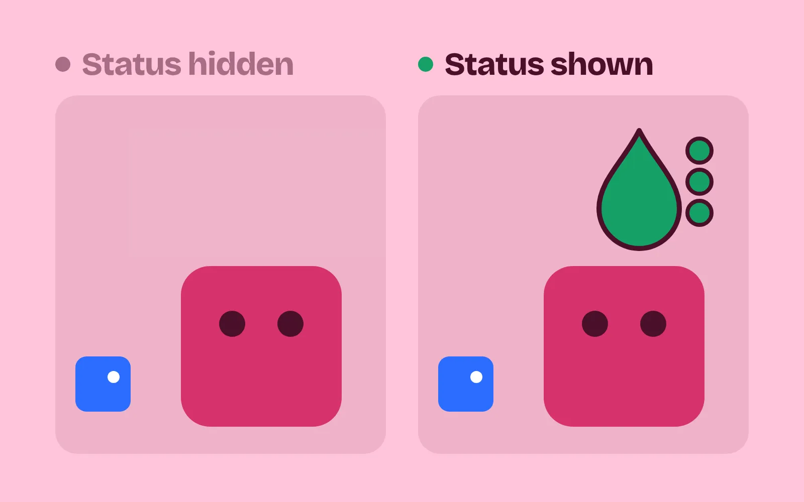
Every icon needs a name. Show a tooltip after about 0.3 s of hovering, so it doesn’t flash while the mouse passes by. Give it the name, what it does and the current number. Don’t rely on hover alone: Xbox’s accessibility guidelines ask that UI works with every input the game supports (Xbox Accessibility Guideline 112), so add long-press for touch and focus for gamepads. In the demo, the cursor rests on Mira’s poison drop, then the shield button. The left shows nothing. The right shows “Guard” and, for the drop, “Loses 6 HP at the start of Mira’s next turn”.
2. Plain effects
Write what happens, not your internal stats. “Hits 20% harder”, not “+0.2 ATK mult”; “Heals 5 HP a turn for 3 turns”, not “HEAL 5/t ×3”. The Game Accessibility Guidelines put it in four words: “Use simple clear language” (Game Accessibility Guidelines). Keep the numbers, though. Slay the Spire’s playtesters reportedly liked exact numbers on enemy intents more, and they “didn’t require memorizing symbols” (Wikipedia). Show only the stats this thing touches, and put the most important one first, in bold. Aim for under 25 words per tooltip; our demo’s tooltips average about 12.
3. Nested terms and a glossary
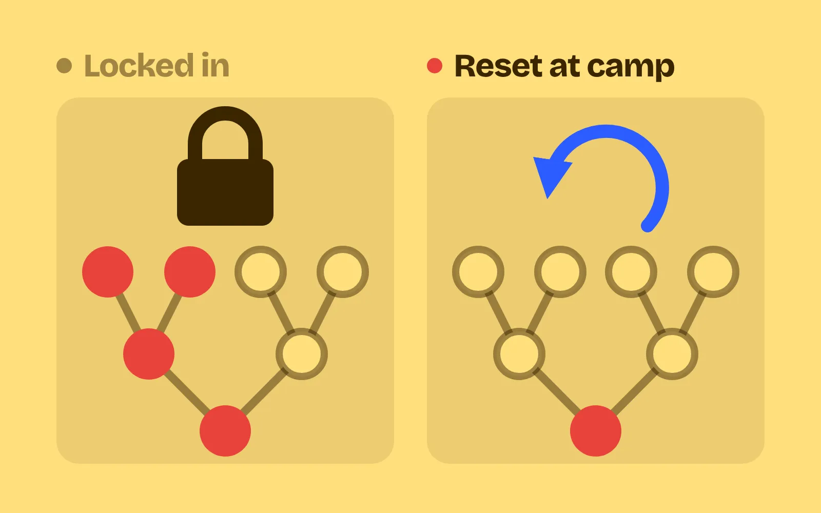
A tooltip about the spider mentions Poison, but what is Poison? Colour every game keyword the same way, and let it open its own tooltip. For that, the first tooltip has to stay put while the mouse moves into it: lock it after about 1 second, or on a key. Crusader Kings III reportedly waits “a second or two before locking the tooltip in place” and also lets you lock it with the middle mouse button (GameWatcher). Victoria 3 took the same system (PCGamesN). The same entries make a glossary one press away. In the demo, the left tooltip vanishes as the cursor leaves the spider. The right one pins, Poison opens its own tooltip, and “Open in glossary” opens the full list.
4. Rule call-outs
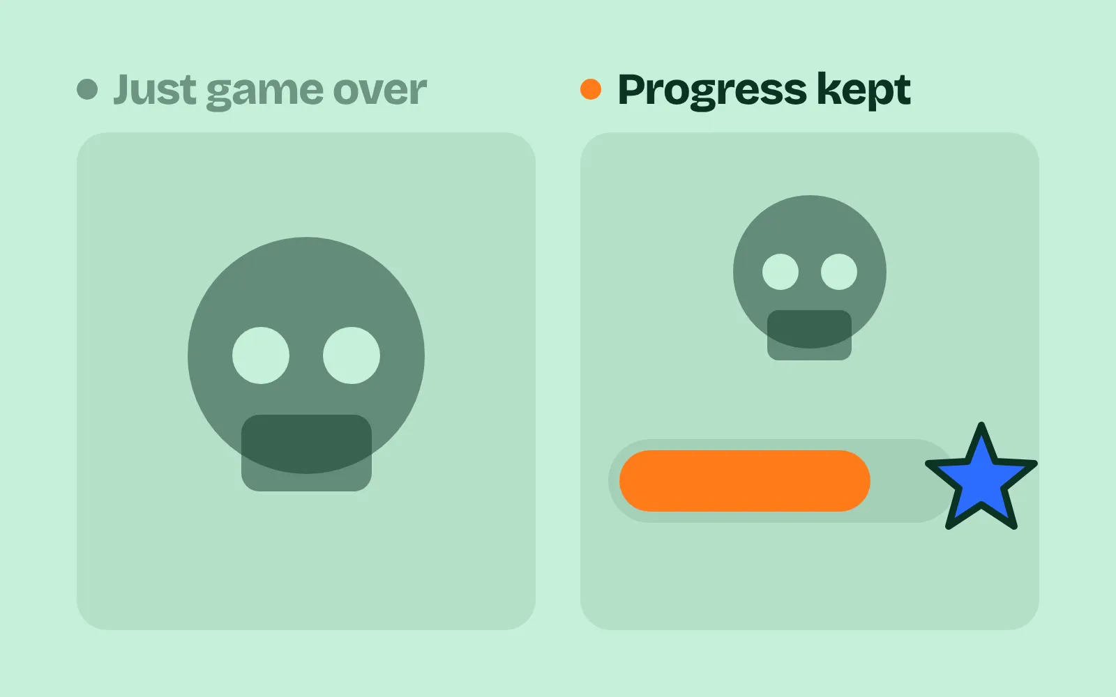
Hidden rules feel like bugs. Show state before it matters: a status icon with a counter on the unit. When a rule fires, name it right where it happened, for about a second (“Backstab ×2”, “Armor blocked 3”). And when something dies, say what did it. Subset Games said of Into the Breach that “it’s very clear how or why you failed so that you can feel like you can improve” (Game Developer). In the demo, Bram strikes from behind and the turn ends. The left shows a 12 with no reason, then just “Mira fell”. The right shows “Backstab ×2” where it fired, a poison drop with a 3 on Mira beforehand, and “Poison, 3 stacks, 6 damage” when she dies.
5. Key hints
Players forget the buttons, or never learn them. Put the key on the corner of the button it triggers and next to the selected unit (“Tab next”). Keep one key (? or F1) that lists every control, and make it reachable from the pause menu too. Xbox’s guidelines ask that interaction prompts “stay consistent” across screens (Xbox Accessibility Guideline 112). In the demo, 2 is pressed and Guard works on both sides, but only the right side ever said so. Then ? is pressed, and only the right side shows the controls list.
Explain, don’t bury
More text is not better. A tooltip nobody reads is as bad as none. Some rules for tuning:
- Keep it short. Under 25 words; put detail in the nested keyword or the glossary.
- Don’t pop too fast. About 0.3 s before showing, about 1 s before locking. Faster and tooltips flash over everything as the mouse moves.
- One colour for keywords only. If everything is highlighted, nothing is.
- Call-outs last about a second. Long enough to read, short enough not to cover the next action.
- Check it with your own data. Count items with no tooltip (should be 0), effect texts with internal stat names or no number (0), and deaths with no named cause (0). Our demo’s table went from 10 of 10 items with no tooltip to 0 of 16.
When the question is “what will happen if I do this?”, a tooltip may not be enough; see damage preview. For where all these numbers sit on screen, see game HUD design.
Add it to your game
- Copy the skill at the end of this page into your project.
- Ask your agent: “Players don’t know what my icons and numbers mean. Explain them.”
- Play it, then tune in plain words: “The poison tooltip is too long.”
Art and fonts in the demos: Tiny Dungeon and Kenney Fonts (Kenney Mini, Kenney Pixel) by Kenney (CC0 1.0).
The skill that made it work
This is the whole skill we gave Claude Code. Copy it into your project and ask your agent to explain your game's icons, numbers, rules and controls. Every trick sits behind its own switch, and the last step counts the gaps: icons with no tooltip, effects with no number, deaths with no named cause.
- List every icon, stat, keyword, status effect, hidden rule (bonuses, immunities, stacking) and control in the game.
- Put every trick behind one named switch in a single settings object, all on by default, so each can be tested on its own.
- icon-labels. Every icon gets a short text label or a tooltip: on hover after about 0.3 s, on long-press on touch, on focus with a gamepad. The tooltip gives the name, what it does and the current number.
- plain-effect. Write effects as outcomes with numbers: "Hits 20% harder", not "+0.2 ATK mult"; "Heals 5 HP a turn for 3 turns". Show only the stats this thing touches, and put the one or two that matter most first, in bold.
- nested-terms. Colour every game keyword inside tooltips (Poison, Armor, Stun) the same way; hovering it opens its own tooltip. Lock a tooltip after about 1 s, or on a key, so the mouse can move into it. The same entries make a glossary screen one press away.
- rule-callout. Show state before it matters: a status icon with a turn or stack counter on the unit. When a hidden rule fires, name it where it happened ("Backstab x2", "Armor blocked 3") for about 1 s. After a death, say what did it: "Poison, 3 stacks, 6 damage".
- key-hints. Put the key or button beside the action it triggers (on the button's corner, next to the selected unit), and keep a help overlay listing all controls on one key (? or F1) that also opens from the pause menu.
- Measure it. From your list, report items with no tooltip (should be 0), effect texts with no number or with internal stat names (0), average words per tooltip (aim under 25), and deaths in a scripted run that end without a named cause (0).
Save it as .claude/skills/tooltips-and-glossary/SKILL.md in your project. Or connect your agent and type /aigamedev: it loads this skill with its reference files and the results from this post.